JENNY VAN SOMMERS
Background
Jenny Van Sommers is an award winning still life photographer. She worked for many big name brands, such as, Chanel, YSL, Louis Vuitton, Nike, Apple, Tiffany & Co, Audi, etc. Sommers is well known because of her works with these brands. She was born in Australia and now lives in Sei, London. She does most of her work there, but occasionally goes to the U.S. and France to work.
Style
Jenny Van Sommers is an award winning still life photographer. Most of her photographs consist of geometrical objects to give her enticing subjects an uncanny twist. Her style is very basic and easy to understand. Her photographs have a straightforward concept with complicated objects. She possesses texture and color in her photographers, which is why they are so simple. Her works always have one solid background color with minimal background noise, giving it more of the calm and simple effect.
Philosophy
When looking at Sommer’s work, you will see a lot of contrasting color and geometric shapes. She takes these two things and puts them together with light, a different way in each photo. “What first drew me to photography in reality is seeing light and noticing what it does,” she says. “I want to document its immediacy.” Her work is based on admiration from other still life photographers that pursued her career.
Influences
Jenny Van Sommers inspired me as a photographer because her work showed me that you don't have to go over the top with your composition to make it look fancy and professional. For example, when looking at her portfolio, you can see that she doesn't use that many objects, and there's also a total of only 2 or 3 colors in majority of her photographs. There's also only one solid background color in all of her photos, usually black or white. Jenny says she gets her inspiration from other still life photographers. Her biggest admiration comes from Irving Penn, Elsworth Kelly, and Sarah Lucas. She says, "Lucas’ certain roughness, Kelly’s crystallization of shapes and lights and just trying to get anywhere near to how good Irving Penn is.”
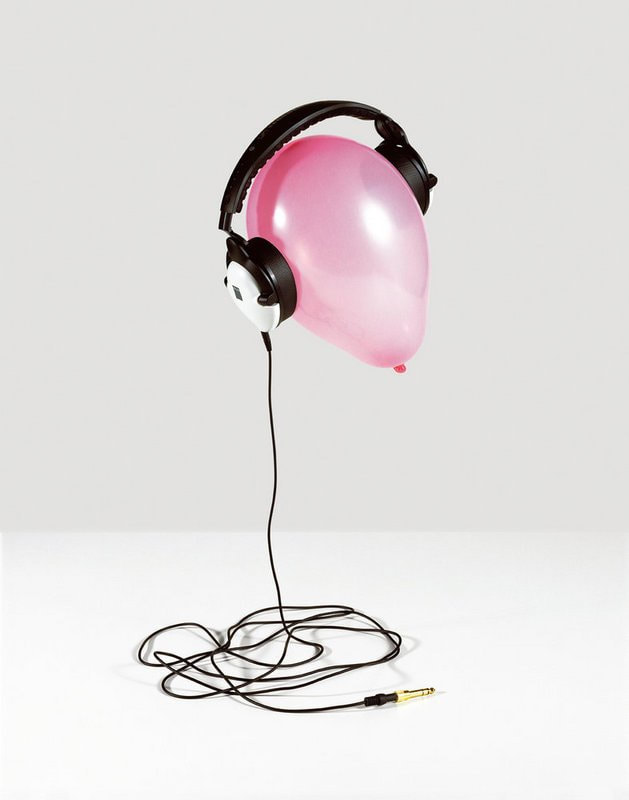
Compare & Contrast

VOGUE (Sommers) |
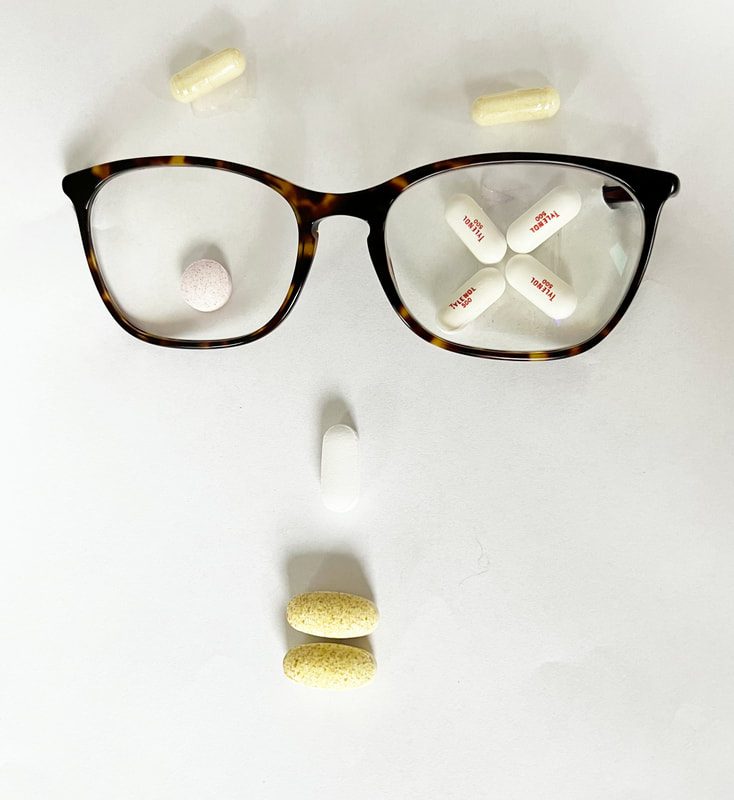
Take Your Meds! |
For this picture, I focused on the meaning of the image rather than the composition and detail. I couldn't find pills that were the same color as the original picture but I think it looks pretty similar. This image was mildly hard to recreate because I couldn't get a nice white background and I had to stick the sides of the glasses through a paper to get it to not be visible. The shadows were also a little to big, at the wrong angle, and weren't black like Sommer's image. In Photoshop, I turned the brightness all the way up and lowered the tone and amount of the shadows.

Untitled (Sommers) |
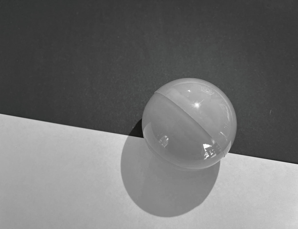
Rolling on the Lines |
This image was also slightly hard to recreate. For the background, I took a black and white construction paper and set it up the way Sommer's was positioned. That was the easy part. For the sphere, I couldn't find an object that was a completely solid color, knowing that the object that I used had some transparency and reflection to it. This made it difficult to manipulate it as much as possible. The sphere was also a little too big, but I think I did the best I could to replicate it. In Photoshop, I turned the brightness up and then converted it to black and white.
Untitled (Sommers) |

Zoned Out |
This image was my favorite to recreate, but it was a bit complicated. The objects itself wasn't hard to put together, but getting a white background and surface like Sommers' was difficult. I had to use a white board for the surface, however, it had scratches and the rim was a different color. To fix this, I went over the whole white board with white paint using the brush tool in Photoshop. Aside from that, the other editing I did was Brightness and Curves since Sommer's picture is very bright.
Artist Statement
I had a lot of fun recreating these images, especially VOGUE. At first, I was getting stressed because the pictures on Jenny Van Sommer's portfolio was all her work with big companies, such as, Chanel and YSL, so I didn't exactly know how I was going to recreate them. After doing a little more digging, I found three pictures that I can successfully recreate. The first image (Take Your Meds!) is a way to tell people keep track of their medications. The second image (Rolling on the Lines) can be interpreted in any different ways, but the way I see it is that it's hard to choose one side, so it's easier to drag yourself on both, which isn't good, hence the black and white. The third and final image (Zoned Out) is a partially euphoric photograph. The balloon represents an empty head, one with no thoughts or feeling, and the headphones are to make it look isolated from reality. This image is overall personified.
I had a lot of fun recreating these images, especially VOGUE. At first, I was getting stressed because the pictures on Jenny Van Sommer's portfolio was all her work with big companies, such as, Chanel and YSL, so I didn't exactly know how I was going to recreate them. After doing a little more digging, I found three pictures that I can successfully recreate. The first image (Take Your Meds!) is a way to tell people keep track of their medications. The second image (Rolling on the Lines) can be interpreted in any different ways, but the way I see it is that it's hard to choose one side, so it's easier to drag yourself on both, which isn't good, hence the black and white. The third and final image (Zoned Out) is a partially euphoric photograph. The balloon represents an empty head, one with no thoughts or feeling, and the headphones are to make it look isolated from reality. This image is overall personified.
